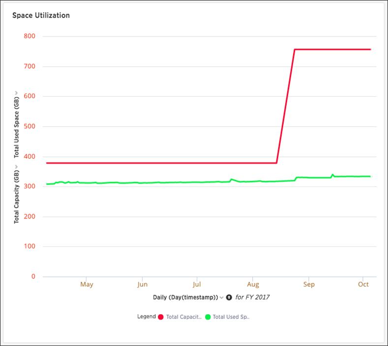
The Space Utilization chart is one of the available charts for you to use when checking the cluster overview. You can find the chart in the Overview section of the System Health center. This line chart displays the total used space, which consists of raw uncompressed data, including replication.

The x-axis is by time. It allows you to zoom in and see daily or hourly data. The y-axis measures the size in GB. So in the Space Utilization chart above, the green line shows the amount of capacity in use in the system, while the red line shows the total capacity. The increase in the red line at the end of the period indicates the addition of extra hardware, resulting in increased capacity.