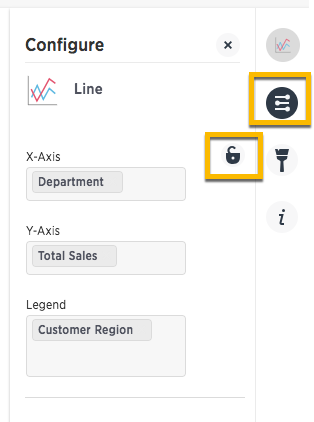
Some charts have additional options under Chart Styles and Configuration Options that are covered in each chart type topic.
Show detail labels
To show detail labels:
-
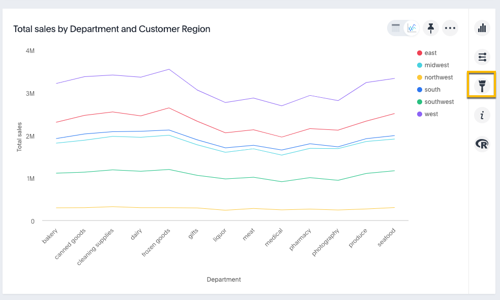
While viewing your search or answer as a chart, click Edit chart styles on the right.
-
Select Detail Labels.
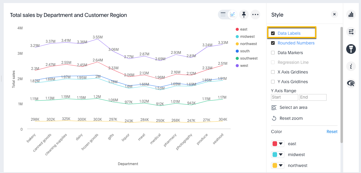
Show rounded or non-rounded numbers
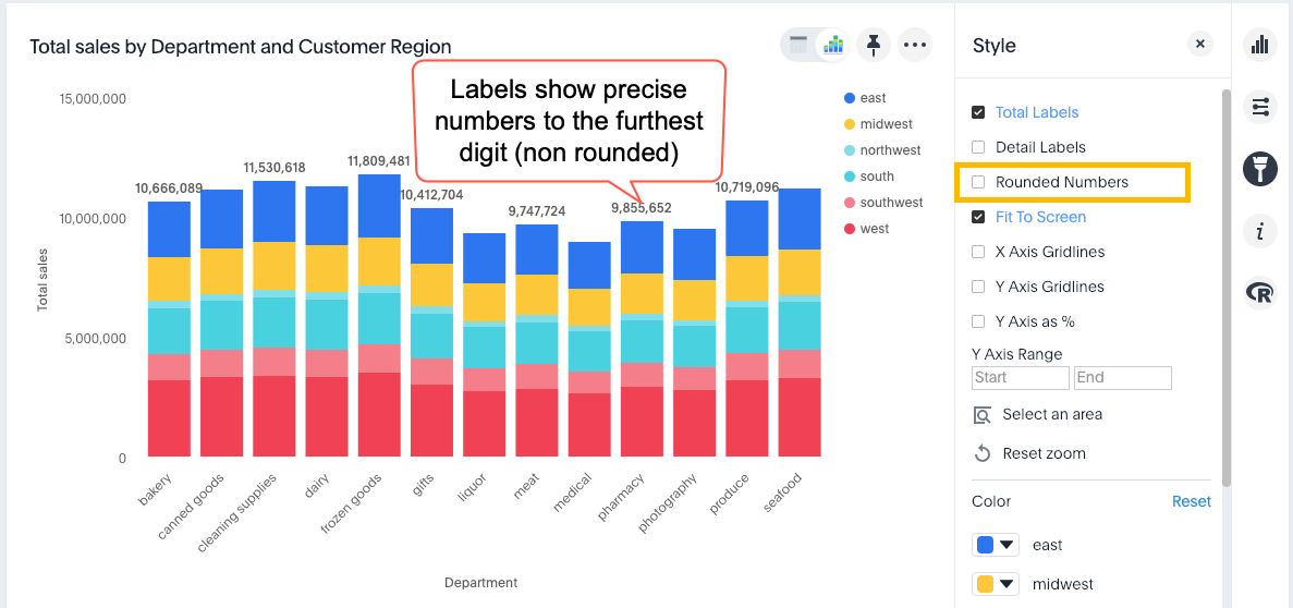
You can toggle this option off to show non-rounded numbers.
-
While viewing your search or answer as a chart, click Edit chart styles on the right.
-
Click Rounded Numbers to toggle on or off.
By default, charts with data labels enabled show rounded numbers on chart labels.
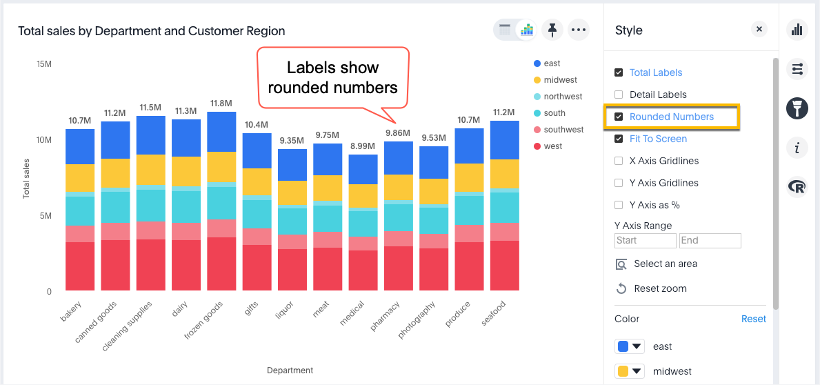
When you uncheck Rounded Numbers, data labels, X and Y axes, and tooltips show precise, non-rounded numbers out to the furthest decimal or integer, based on the underlying worksheet format.
Show data markers
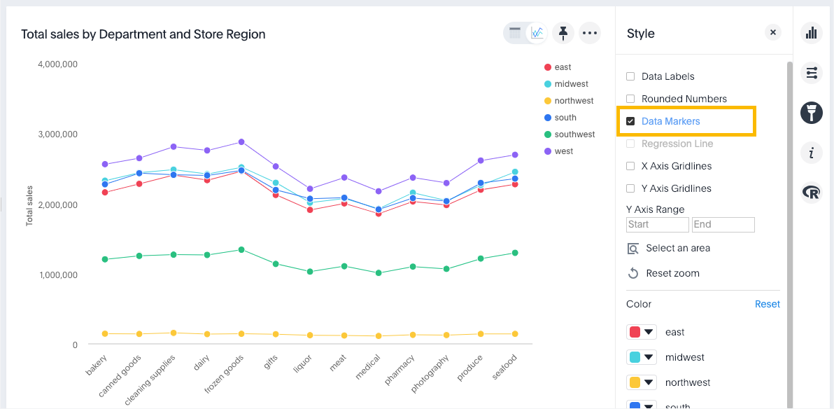
To show data markers:
-
While viewing your search or answer as a chart, click Edit chart styles on the right.
-
Select Data Markers.
Add regression line
- While viewing your answer as a chart, click Edit chart styles.
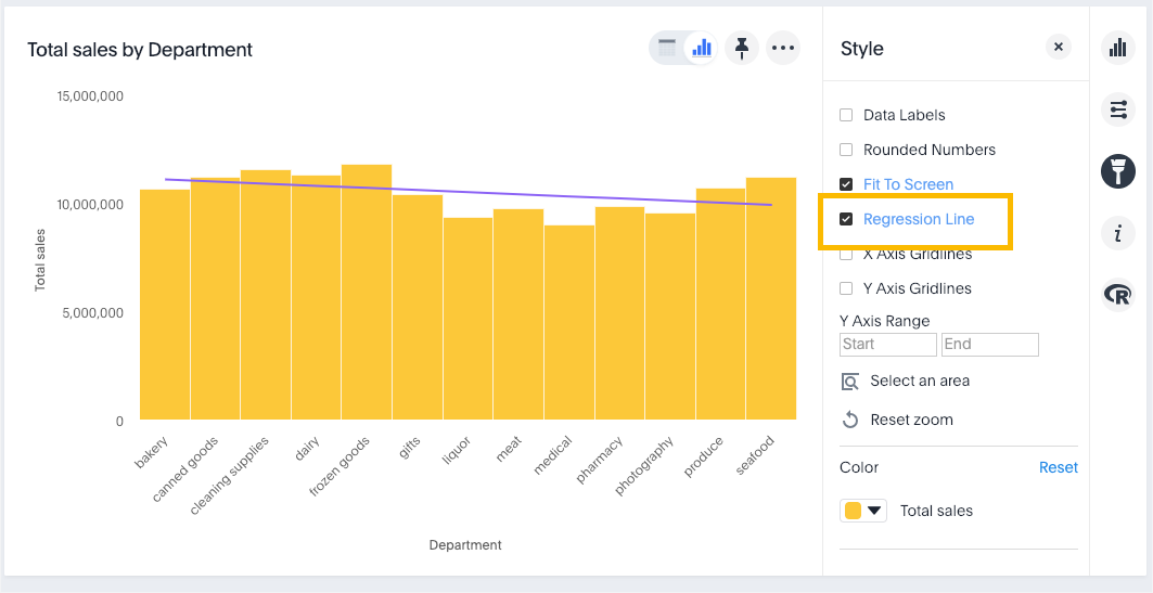
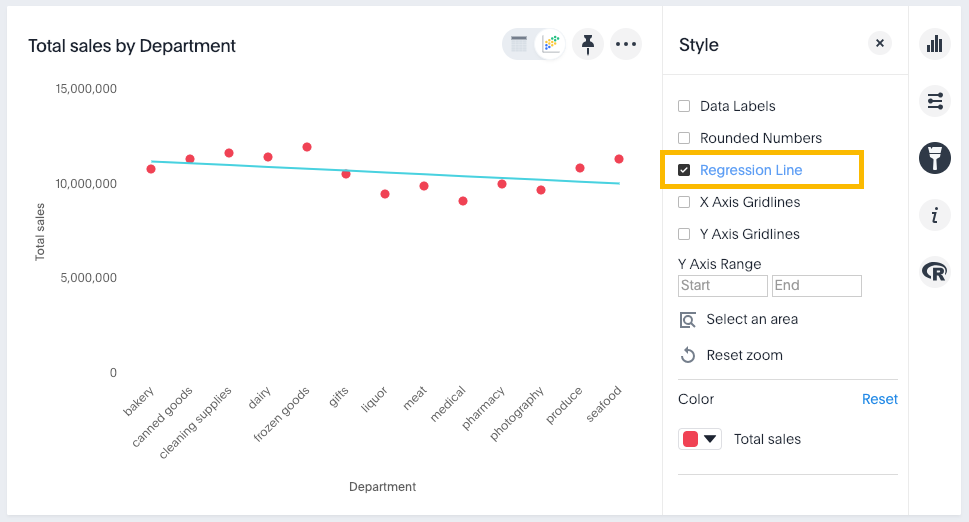
- Select Regression line.
You can show regression lines on most types of charts (bar, stacked bar, line,
bubble, and so on). In the following examples, sales is the measure and department is
the attribute.
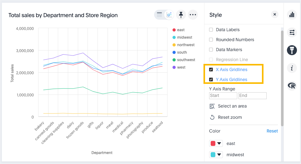
Display gridlines
Charts with X and Y axis can display gridlines. To display them:
- Choose Edit chart styles.
-
Select one or both of the gridline options.
Configure columns for X and Y axis
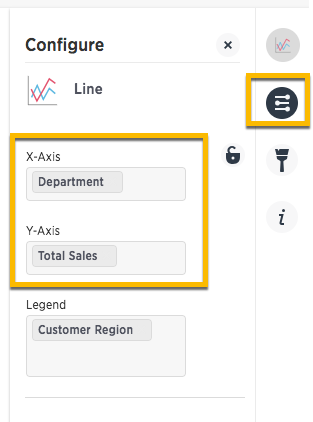
You can specify which fields to show on the X axis and Y axis of a chart.
-
Click Edit chart configuration on the right.
-
Click into the X or Y axis field and select the column used in the search that you want on a particular axis.
Stack multiple measures on the y-axis
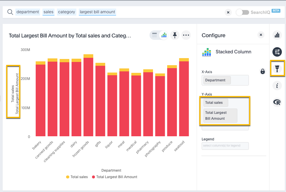
You can have multiple measures on the y-axis of most (but not all) chart types, as follows:
- Create a chart.
- Click Edit chart configuration on the right.
- Click into the Y-Axis field and start typing the name of a measure used in the search.
-
Select the measure you want.
The chart updates to show multiple measures on the Y-Axis.
-
If your original chart had a legend, you will get a message stating “When there are multiple columns on the y-axis, you cannot add a legend.
<Measure>is already in use.” If so, remove the legend and the chart will update to show multiple measures on the y-axis. -
In some cases, the y-axis measures will show one on either side of the chart (left and right) instead of stacked on the same side, depending on the parameters of the analysis.
-
For a list of chart types to which this applies, see Charts with multiple measures on the y-axis.
-
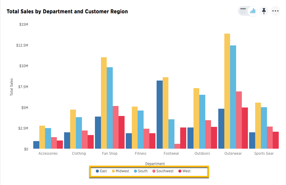
Add columns to a chart legend
You can add to or edit the legend from the chart configuration panel.
-
Click Edit chart configuration on the right.
-
Click into the legend field to add one or more columns used in the search.
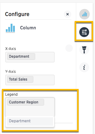
Your changes are saved automatically.
-
View the updated chart.
Lock the chart
You can use the lock icon to prevent ThoughtSpot from recommending other chart options or configurations. For example, you want a line chart, you can lock that display and stop TS from recommending an alternative visualization such as a funnel/pie/column and so forth. A lock applies for all subsequent answers that have the same column set.
