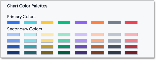
You can change the color palettes that are used to create your charts. Although it is suggested that you stick with the default settings, it is possible to create your own appealing color palettes if done correctly.
To select the chart color palettes:
-
Navigate to the Style Customization by clicking Admin > Style Customization from the top navigation bar. If the Style Customization page is not available, contact ThoughtSpot Support to enable style customization.
-
Navigate to the Chart Color Palettes section at the bottom of the Style Customization page.

-
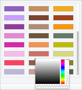
Click the color you would like to change in the primary color palette, and use the color menu to choose your new color.

All of the colors in the primary color palette are used in a chart before any from the secondary palette are used. Therefore, the primary palette usually consists of primary colors.
-
Click the color you would like to change in the secondary color palette, and use the color menu to choose your new color.

The colors from the secondary color palette are used after all of the colors have been exhausted from the primary palette. Therefore, the secondary palette usually consists of secondary colors.
-
Click the Reset button on the upper right hand side of the section if you would like to bring back the default color palettes.