To change the colors used in a chart, use the color picker on the chart styles panel. You can set colors for:
- bars, lines, areas, bubbles, maps, and other visuals on charts
- legends on charts
- tables for conditional formatting
- tags and editing the colors
To change the chart colors, you need at least one column in the chart’s legend. If the chart does not have a legend (not all do) and it is a single-measure chart, you can apply a conditional format to change the color. This type of conditional formatting does not work with Line charts.
Colors are maintained across searches within a session. For example, when doing a search on revenue by state, each state will keep its color assigned to it even if you change the search or chart type.
Set colors on a chart
-
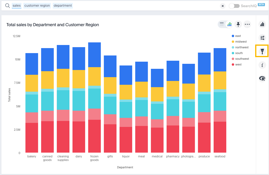
While viewing your search or answer as a chart, click Edit chart styles (
 ) to open the Styles panel.
-
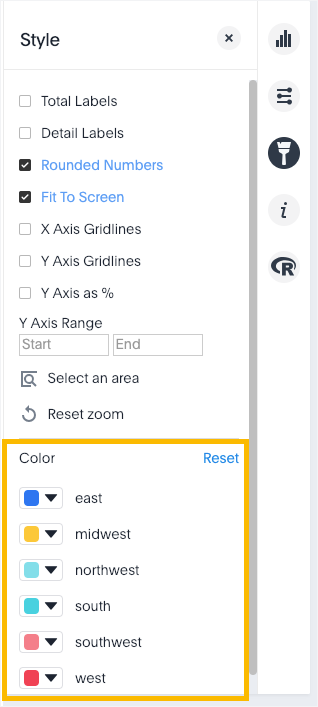
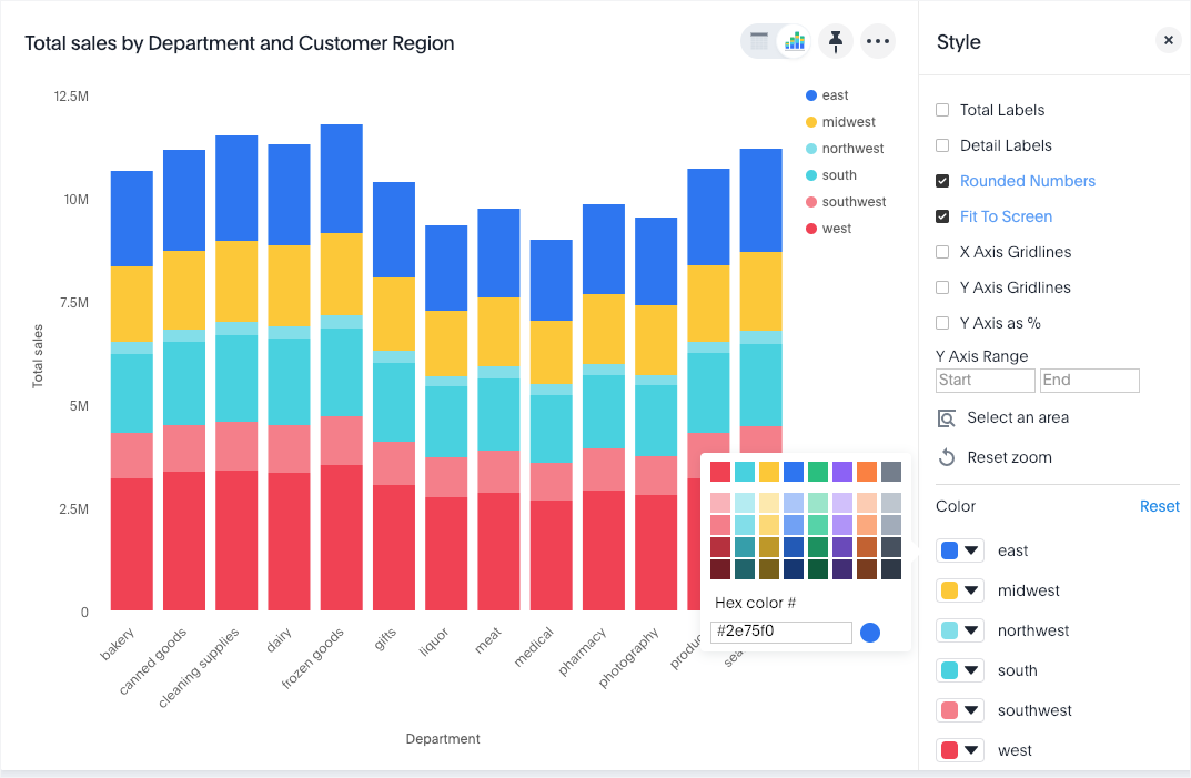
On the chart, click the color icon of the label or legend value you would like to change the color of.

-
Use the color picker to choose a new color to represent that value.
You can also enter a HEX value directly.

Your changes are saved immediately.
-
Click the X at top right to dismiss the styles panel.
Set pie chart slice colors
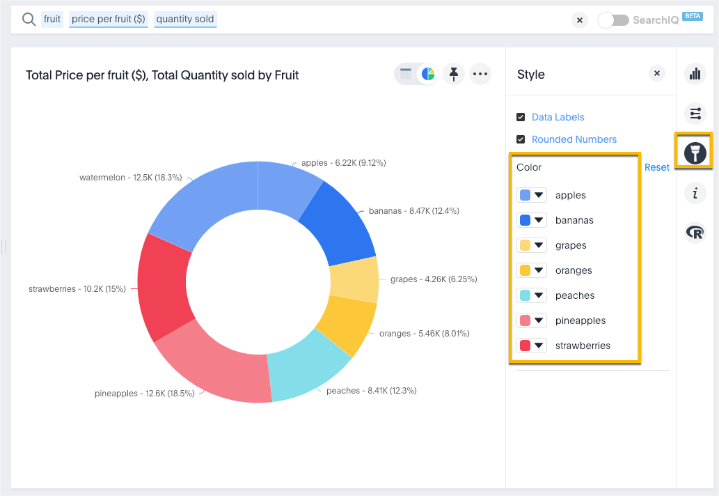
To customize the colors of each slice in a pie chart.
-
While viewing your search or answer as a pie chart, click Edit chart styles (
 ) to open the Styles panel.
 -
Assign a color of your choice to each pie slice.

-
Click
 and choose Update to save the changes.
 -
Click Close.
Optionally, you can click Reset to use the default colors.