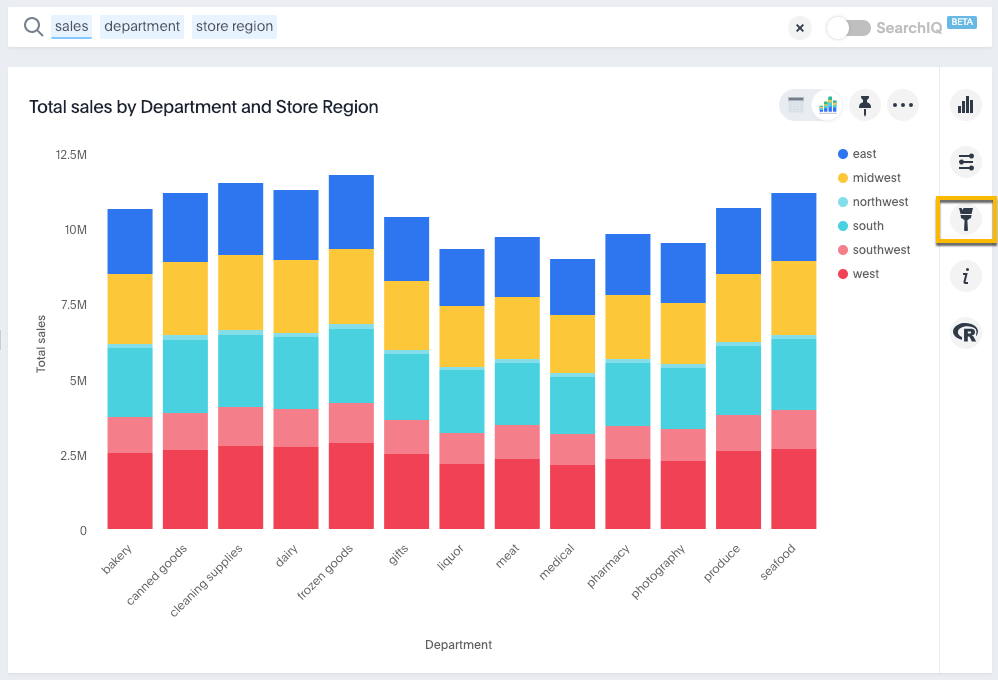
On charts, you can manually configure the y-axis range to be different from the search default. You can have multiple measures on the y-axis of many charts.
You can manually set the y-axis range by using the Edit chart styles icon.
Setting the y-axis range
The style panel includes the option to manually set the y-axis range. To set the y-axis range:
-
While viewing your answer as a chart, click Edit chart styles.

-
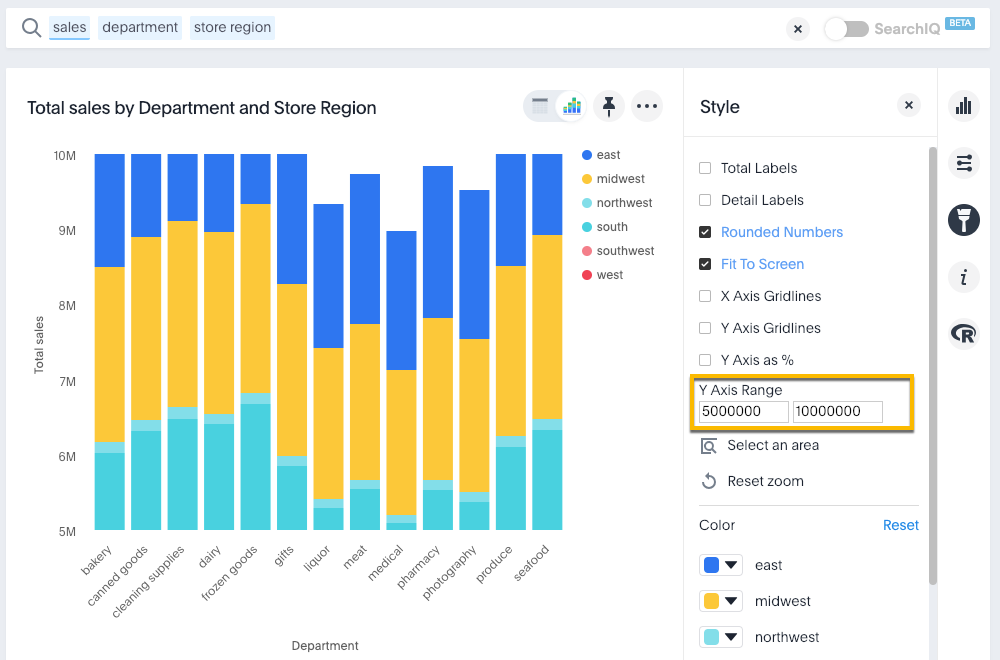
Under Y-Axis Range enter your preferred start and end values.
In this example, our original chart is showing sales values by department from 0 to over $10M. We can enter a y-axis range of
5000000to9000000to show only sales between $5M and $10M.The chart will reorganize itself to reflect the new y-axis range.

Create charts with multiple measures on the y-axis
You can have multiple measures on the y-axis of most (but not all) chart types. You can configure this on the chart styles panel. To learn more, see these topics: